Vertical Video Dimensions the Ultimate Developer Guide 2026
Published on
Tags:
Vertical video dimensions are 9:16, usually exported at 1080 × 1920 pixels. That answer is correct, but it hides the part that breaks uploads, crops text, and makes clean-looking clips render wrong in production.
Table of Contents
The Vertical Video Problem You Probably Have
You render a clean 1080 × 1920 file, send it through the API, and the post comes back cropped, letterboxed, or rejected for a reason that does not match the file you uploaded. That is the failure mode many teams hit the first time they publish social video programmatically.
The basic advice is simple enough. Use 9:16 and export at 1080 × 1920 pixels, the standard described as the gold standard and the default cross-platform baseline for mobile-first placements (IdeaRocket, Shutterstock, LiveAPI). The issue is that the file spec isn't the whole job.
The frame is only the container
A vertical master can still look wrong if the subject sits too close to the edge, if text lands under UI controls, or if the platform decides to reframe the upload. The same file can look clean on one surface and broken on another because the player, the safe area, and the transcode step all affect what viewers see.
Practical rule: treat the exported frame as the delivery envelope, not the creative canvas.
That problem shows up fast in API-driven publishing. The upload can validate, the dimensions can match, and the post can still fail visually once platform UI gets layered on top or the service applies its own encoding rules.
The fix is not to memorize one setting and hope for the best. Build around the baseline, then account for the parts that change how the post appears to a viewer. A unified API like PostPulse helps by hiding some of that platform-specific mess, so you spend less time chasing upload quirks and more time checking whether the composition survives delivery.
Why Every Platform Has Different Vertical Rules
My video looks wrong. That usually means the file was exported correctly, but the platform still changed how it appears once it hit the feed. The behavior starts with mobile viewing, because vertical playback fits the way people hold phones, and social apps built their defaults around that habit. A guide from Firework also notes that a significant portion of social video is watched on mute, which is why captions and on-screen text keep showing up in platform recommendations.
Why mobile behavior shaped the spec
People hold phones upright, so platforms made portrait playback the default instead of making viewers rotate their screens. That is why 9:16 won out. It matches the device, fills the screen, and gives the app less reason to waste space on unused borders.
The same mobile-first logic is why platform rules are so inconsistent. One app may care most about feed fit, another may prioritize how the clip behaves in stories or shorts, and another may re-encode the file in a way that changes the final crop or text placement. Developers run into this constantly when they publish through APIs, because a file can pass validation and still look off after the platform applies its own playback rules.
The frustrating part is that the spec on paper does not include the viewer experience. Safe areas, UI overlays, caption placement, and automatic reframing all affect whether the content survives the upload intact.
That is why the practical job is not just to optimize videos for social media. It is to ship a vertical master that still works after each platform processes it differently, whether you are handling uploads manually or routing them through a unified API like PostPulse.
The 9 to 16 Gold Standard Explained
“My video looks wrong” usually means the file was exported in the wrong shape, then cropped, padded, or re-encoded by the platform on upload. The clean starting point is still 9:16 at 1080 × 1920 pixels. That format fills an upright phone screen without side bars, which is why technical guides and platform specs keep returning to it as the default vertical master, even though each app handles the file differently (Instagram ad specs, W3C Media Working Group, Apple Human Interface Guidelines).
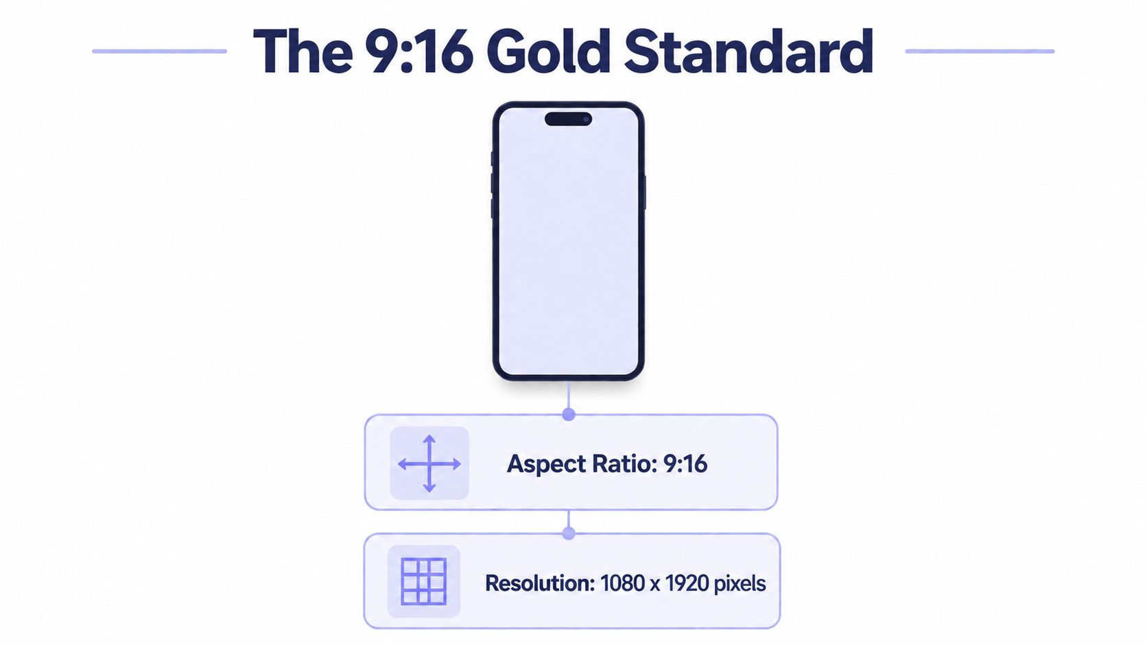 A diagram illustrating the standard 9:16 vertical video aspect ratio and 1080 by 1920 pixel resolution.
What to export when you want one master file
If you need one source file that can survive across placements, export the frame as 9:16, keep 1080 × 1920 as the default canvas, and use a container that common social pipelines accept, such as MP4 or MOV. That gives you a predictable baseline before any platform-specific processing starts. One platform-focused source also calls out a 10–15 Mbps target bitrate for standard 1080p vertical video (AdaptlyPost).
The next decision is source quality. A vertical master works best when the original shoot leaves room for later crop adjustments, subtitle placement, and UI overlap. One production guide recommends framing for the full vertical canvas, keeping the subject centered, and preserving enough resolution so minor reframing does not damage detail (Artlist).
For adjacent social placements, optimize videos for social media is a useful reminder that aspect ratio choices often change between feeds, stories, shorts, and embeds.
What not to assume
Matching the dimensions alone does not guarantee a clean result. A file can be the correct shape and still look off if the codec, bitrate, or crop strategy is wrong. That is the part people miss when they treat 9:16 as a finished spec instead of a starting point.
If your publishing pipeline only stores “9:16, 1080 × 1920” and ignores the rest, the export will eventually pass validation and still disappoint on a phone. A unified API like PostPulse helps by normalizing the messy parts of delivery so you are not hand-tuning every platform's edge cases one by one.
The Real Usable Area Safe Zones and UI Overlays
My video looks wrong, even though the frame is 1080 × 1920. That usually means the export is technically correct but the usable area is not. Social apps place buttons, captions, profile elements, and playback controls on top of the image, so the outer edges are often the first part to get buried. A production guide recommends marked 9:16 safe zones, testing on real mobile devices, and overscanning because notches and UI elements can clip the edges (Garage Productions).
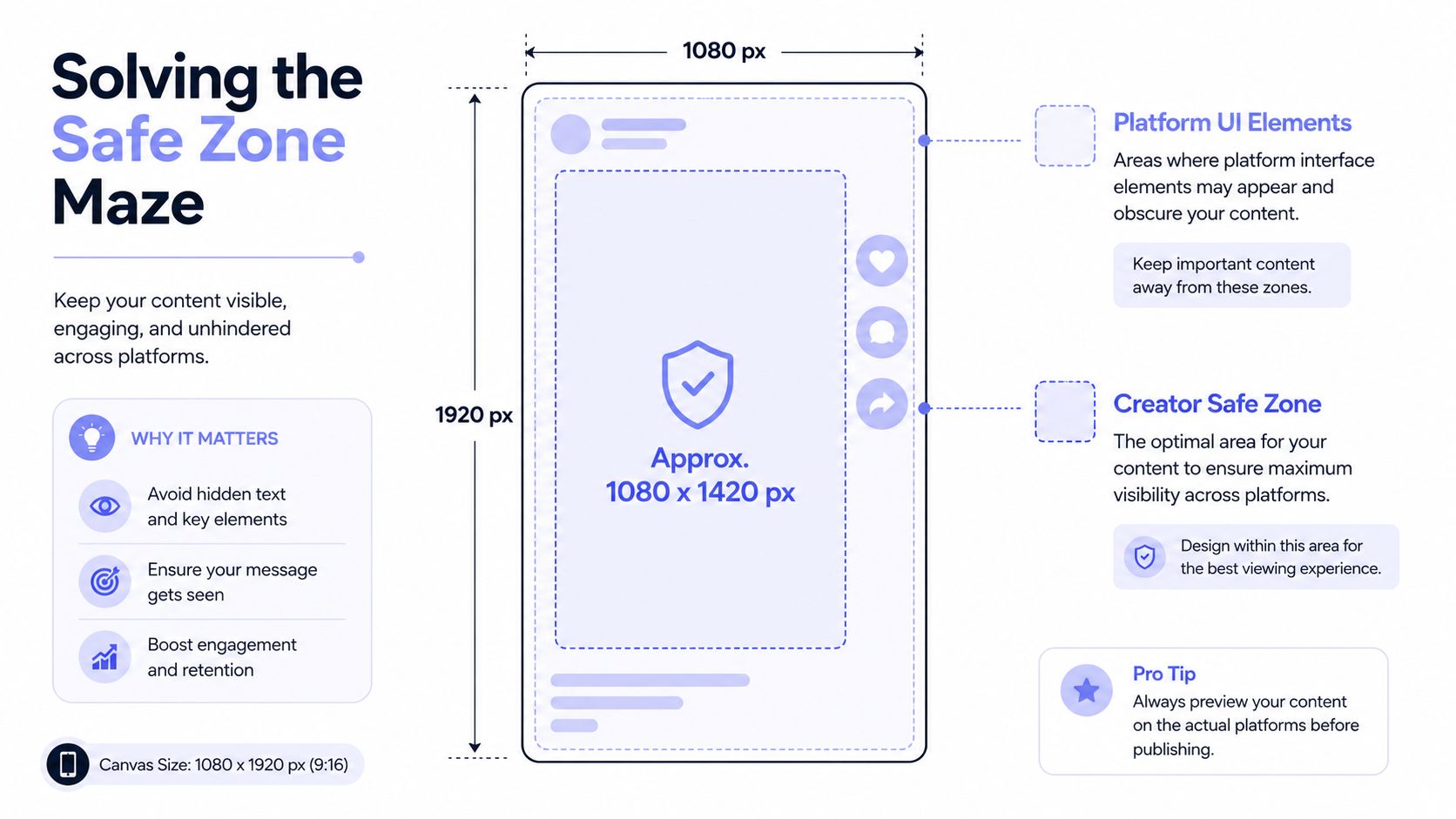 An infographic showing the optimal safe zone dimensions for creating vertical videos for social media platforms.
Design for the middle first
Keep the important material in the center and treat the outer band as unstable. That applies to readable text, product screenshots, and faces that need to stay visible after the app adds its own chrome.
One source advises keeping important visuals within the central 75% of the screen and notes that a significant share of mobile video is watched with sound off, so the composition has to work without audio cues (Garage Productions). That matches the production reality on social platforms. The more text-heavy the cut, the more conservative the framing needs to be.
Keep the hook in the center, not at the edge where app controls can bury it.
For teams publishing Instagram content, the safe-zone problem shows up most clearly in Stories and Reels, where overlays are easy to underestimate. A practical implementation reference is Instagram ad specs, especially if you are building reusable templates for multiple placements.
The same issue shows up in Reels safe zones and export settings, where text placement and UI clearance need to stay aligned with the final delivery format.
Why safe zones matter in automation
If you generate videos from templates or push them through an API, safe zones have to live inside the template logic. They cannot be a last-minute design note. Otherwise, the render passes QA and still fails in the app.
That failure mode is frustrating because it is visual, not structural. The file is valid. The clip plays. The post still looks cheap because the UI sits on top of the important part.
A unified API like PostPulse helps by keeping the delivery rules consistent across platforms, so the render pipeline does not depend on someone manually fixing every crop and overlay risk before publish time.
Platform-Specific Vertical Video Dimensions
My video looks wrong is the complaint that usually shows up first. The file may be valid, the aspect ratio may be right, and the export may still look broken once the platform adds its own controls, crops, or feed treatments. The operational fix is to treat 9:16 as the baseline, then handle each platform's delivery quirks separately.
The shared shape is simple enough. The publishing rules are not. Some platforms want strict portrait delivery for the main viewing surface, while others tolerate alternate ratios in limited placements and still punish sloppy framing once the UI layers appear.
TikTok
TikTok is built around portrait playback, and the clean baseline is 9:16 at 1080 × 1920 pixels. In practice, the frame needs to stay centered because captions, buttons, and other interface elements crowd the right side and lower part of the screen fast. If you publish through automation, keep the platform workflow at PostPulse TikTok publishing as the reference point for how the asset should be handed off.
Instagram Reels and Stories
Instagram uses the same 9:16 vertical format for both Reels and Stories at 1080 × 1920 pixels. The hard part is not the ratio, it is how the platform changes the visible area across feed, Stories, and Reels surfaces. A practical reference on Reels safe zones and export settings helps when you need text, subject placement, and UI clearance to survive all three placements.
YouTube Shorts
YouTube Shorts also relies on 9:16 and 1080 × 1920 for the cleanest fit in the Shorts feed. Other ratios can work in some pipelines, but the experience changes as soon as the video no longer fills the phone screen the way the feed expects. That is usually where vertical metadata looks fine while the viewing result feels off.
Facebook and Pinterest
Facebook Stories and Reels follow the same portrait baseline, and Facebook feed content often works better with taller framing when the goal is to stop the scroll. Pinterest is looser in what it accepts, but vertical video still fits the discovery flow more naturally than wide footage pushed into a narrow slot.
Snapchat
Snapchat normalized portrait video early, so the shape itself is usually not the problem. For developers, the key checks are clipping, export quality, and whether the asset survives the UI layer without the important part being hidden. That is the kind of failure that passes validation and still looks wrong on the phone.
For teams publishing across multiple apps, one master at 9:16 reduces the number of decisions that have to be made at render time. Platform rules then become formatting constraints around that master, not a separate editing pass for every destination. When a workflow also needs to branch into different app behaviors, a unified API keeps the delivery logic consistent instead of forcing manual fixes for each upload path.
Workflow Strategies Shoot Vertical or Crop Later
My video looks wrong is usually the first signal that the workflow was chosen too late. A clip framed for the phone can look clean from the start, while a wider source file can drift off-center, clip text, or hide the action once it gets forced into portrait delivery.
Native vertical capture keeps the subject in the right place at shoot time. You compose for the phone, the frame already matches the destination, and post-production stays focused on cleanup instead of rescue work. That is the simpler path for clips that only need vertical placements.
The trade-off with cropping later
Cropping from a wider source gives you more room to repurpose a single shoot. One independent guide notes that a common approach is to shoot wide and crop in post, while some videographers prefer open-gate capture at 5K or 6K so one take can be adapted across orientations (Medium guide). The upside is reuse, the downside is that every crop becomes a framing decision after the fact.
That is where quality starts to slip. A centered subject can survive a vertical crop without much trouble. A moving subject, a left-anchored product shot, or text placed near the edge often does not.
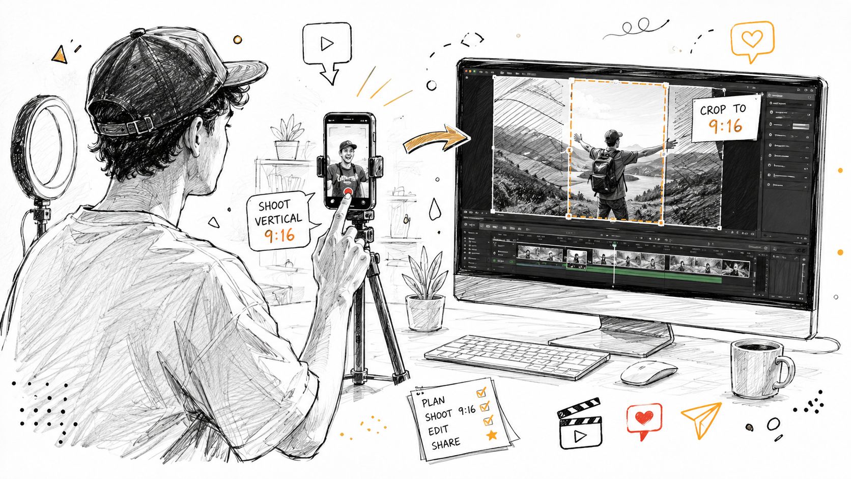 A digital illustration showing a person filming vertical content on a smartphone and editing it on a computer.
When each workflow makes sense
Native vertical: best for shorts, stories, UGC, and paid placements where the frame has to fill the screen from the start.
Crop later: better when one shoot has to serve multiple deliverables, especially when the source resolution is high enough to survive reframing.
Open-gate capture: useful when teams want the most post-production flexibility and can handle the extra editing complexity.
Tools matter here too. FlexClip is a practical online editor for resizing and reformatting clips when you need fast social versions without rebuilding the whole timeline.
The same logic applies to repurposing strategy. A reusable source that stays flexible in post is much easier to manage if your team is planning for distribution variants, not just one final export. For a closer look at that workflow, see our guide to content repurposing strategy. For teams that turn one clip into many social-ready cuts, ShortGenius automated ad generation fits naturally into the process.
If you are building a repurposing pipeline, keep the original framing conservative and make the vertical version a deliberate output instead of a rushed crop. That usually separates a clip that feels native from one that looks forced into the app at the last minute.
Solving The Dimension Maze with a Unified API
Once you've dealt with ratios, safe zones, crop strategy, and export settings, the main pain point becomes obvious. The hard part isn't making one vertical file. It's keeping every social destination happy without maintaining separate logic for each platform.
That's where a unified publishing layer starts to make sense. PostPulse is one option for this kind of workflow, since it routes publishing through a single surface instead of forcing you to wire up each destination separately. It also offers media validation that can verify aspect ratio requirements and check whether uploaded media meets platform standards.
 Screenshot from https://post-pulse.com
Why the API layer matters
If a platform changes its acceptance rules or formatting behavior, the failure shows up in your publishing pipeline, not in the design mockup. A unified API reduces that blast radius because the validation and publishing logic lives in one place instead of being duplicated across apps, scripts, and automations.
That matters most for teams shipping social publishing inside a product, an internal tool, or an automation stack. One integration path is easier to maintain than five different ones, especially when the job is mostly about getting the same asset into multiple feeds without silent formatting mistakes.
Build once around a validated media pipeline, then let the publishing layer handle the destination-specific mess.
For no-code and automation teams, the same logic applies through REST, n8n, or Make.com. The point isn't abstract convenience, it's reducing the number of places where a perfectly valid clip can be rejected for the wrong shape or the wrong render behavior.
Vertical Video Dimensions Quick Reference Table
Use this as the bookmarkable cheat sheet for the core vertical video dimensions conversation. The table keeps the fundamentals in one place, but the safe-zone and UI overlay issues above still apply when you ship the post.
Platform | Placement | Aspect Ratio | Recommended Resolution | Max Length | Max Size |
TikTok | Short-form feed | 9:16 | 1080 × 1920 px | Not specified in verified data | Not specified in verified data |
Reels and Stories | 9:16 | 1080 × 1920 px | Not specified in verified data | Not specified in verified data | |
YouTube | Shorts | 9:16 | 1080 × 1920 px | Not specified in verified data | Not specified in verified data |
Stories and Reels | 9:16 | 1080 × 1920 px | Not specified in verified data | Not specified in verified data | |
Video Pins | 9:16 or 1:1 | 1080 × 1920 px for vertical | Not specified in verified data | Not specified in verified data | |
Snapchat | Snaps and Stories | 9:16 | 1080 × 1920 px | Not specified in verified data | Not specified in verified data |
The practical takeaway is boring, which is usually a good sign in engineering. Default to 9:16, export at 1080 × 1920, keep important content inside the safe middle, and don't let the platform UI own the edges. That gets you much closer to predictable output than guessing your way through each app's quirks.
If you're building a social publishing workflow, PostPulse can take the dimension and validation headache off your plate so you're not hand-maintaining platform-specific rules in every app or automation. Visit PostPulse if you want a unified publishing layer that handles the messy parts of vertical video delivery while you keep control of the content itself.
About the Author

Founder of PostPulse — a social media scheduling platform for creators and teams. Software engineer with a passion for building developer tools and simplifying complex API integrations across social media platforms.