Instagram Text Formatter: Style Captions & Bios
Published on
Tags:
You can spend twenty minutes perfecting an Instagram caption, paste it into the app, and watch the spacing flatten, the Unicode styling degrade, or the whole thing look different on a second device. That's the part people don't talk about enough. The hard problem isn't making text look good once, it's making it survive Instagram's editor, the character limits, and the copy-paste path you use in production.
Table of Contents
Why Instagram Text Formatting Breaks So Easily
You can write a caption that looks clean in Notes or Google Docs, paste it into Instagram, and watch the spacing shift just enough to break the rhythm. I have seen the same thing happen when a styled Unicode phrase gets copied across devices, then looks different after a browser or app update. The problem is usually not the text itself, it is the way Instagram and the surrounding tools handle it.
Instagram is not a rich text editor
Instagram's caption system gives you up to 2,200 characters per post, bios are limited to 150 characters, and usernames to 30 characters, so the visible space is tight before formatting enters the picture. The first 125 characters of a caption are what users typically see before truncation, which is why the opening line carries so much weight. A practical overview of those limits is laid out by Sendible. Line breaks and spacing are not cosmetic details, they are part of the hook.
Practical rule: if the first screen of your caption does not work without the rest, the format is doing too much of the job.
Instagram also does not behave like a document editor with native rich text. Most formatting tools work around the platform by generating Unicode text that looks bold, italic, script-like, or otherwise stylized when pasted back in. That works often enough to be useful, but it is still a workaround, not a guaranteed rendering layer.
For teams shipping Instagram publishing workflows, the Instagram Graph API publishing flow is worth mapping before formatting becomes part of the handoff. If the caption pipeline is already fragile, the publishing step should not add another point of failure.
The visible problem is often the invisible one
Formatter tools exist because the surface area is small and the constraints are unforgiving. Instagram supports up to 30 hashtags per post, but tool guidance commonly recommends only 3–5 highly relevant hashtags for cleaner formatting and better relevance. That is another reminder that the platform rewards restraint, not decoration.
A lot of creators learn this the hard way. They build a caption with tight spacing, then discover that what looked aligned in one draft collapses after paste, edit, or device switching. The result is not just uglier text, it is weaker scanning behavior, because the reader cannot parse the message fast enough.
How Instagram Text Formatter Tools Work
Most formatter tools solve the same problem in two different ways. One path applies Unicode styling as you type. The other lets you paste text, select a segment, and apply formatting before you copy it back out. Both approaches are built to avoid manual reformatting inside Instagram itself (Postoria).
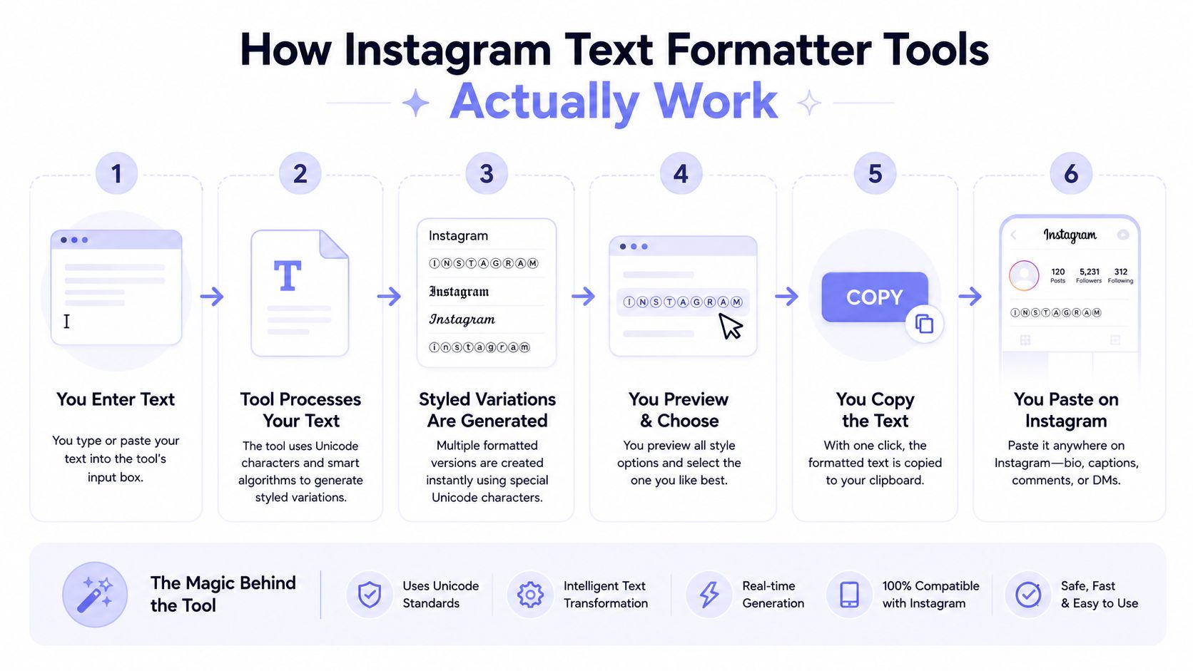 A step-by-step infographic illustrating how an Instagram text formatter tool processes and transforms standard text inputs.
Live styling vs paste and apply
The first workflow is faster for short snippets. You type, pick a style, and the tool converts the text live into a Unicode variant such as bold, italic, monospace, or script-like lettering. The second workflow is better when you're refining a larger caption because you can format only the parts that matter, then copy the result back out.
This distinction matters because not every post needs the same amount of styling. Static-image captions are often kept to 50–150 words, Reels to 1–3 sentences, and some publishers recommend 200–400 words for feed captions depending on the layout and the role of the caption in the post (PostNitro). That range makes the formatting workflow itself part of the publishing decision, not just a style preference.
Character limits shape the workflow
A formatter that ignores limits is a liability. Tools such as UtilTap expose a Bio mode at 150 characters and a Caption mode at 2,200 characters, which is useful because the live counter keeps the text inside the platform's boundaries while styling it (UtilTap). That is the right model for bios, where a single extra character can push a carefully spaced layout off the edge.
The practical reuse area also varies by tool. Some tools say styled text can be pasted into captions, comments, or bio, while others extend that claim to direct messages as well, so the scope should be checked per product (WebUtility). In other words, the formatter is only half the story. The destination inside Instagram still matters.
Keep the styling light. One or two font accents usually survive better than a wall of mixed Unicode effects.
Choose the tool by the output, not the novelty
If you're formatting a short bio, a two-path editor with a live counter is usually enough. If you're building captions at scale, the ability to draft outside Instagram, apply styles selectively, and preserve a stable copy-paste path matters more than the novelty of the font list. The best tool is the one that produces the same result on the device you'll publish from, not the one with the longest font gallery.
For teams that also automate publishing, the formatting step should fit the handoff cleanly, including workflows like how to format Instagram videos. If the text looks right in the formatter but breaks when it reaches the scheduler, the tool has not solved the core problem.
Preserving Line Breaks and Spacing Across Devices
Line breaks are where most Instagram formatting falls apart. The problem isn't just that text can look cramped. It's that empty lines can disappear when you move from one drafting surface to another, or from one device to another, and suddenly the caption reads like a block of mashed-up copy.
Why plain breaks are unreliable
Independent formatter guidance says plain line breaks are often collapsed in bios, and the workaround is to use invisible Unicode separators such as Braille Pattern Blank (U+2800) to preserve spacing (Aibrify). That's a small technical detail with a big practical effect. It means the difference between a bio that breathes and one that looks like an accidental run-on sentence.
The safest drafting habit is still to write outside Instagram and paste in afterward. Notes apps are usually more reliable than trying to sculpt spacing in the app editor itself, because the source text stays intact until the last possible moment. That matters even more in bios, where the 150-character limit gives you very little room to recover from bad spacing.
Device behavior changes the outcome
Spacing can behave differently on Android and iOS, and that's where a lot of “works on my phone” bugs come from. Some formatting survives posting, then gets disturbed when you edit later. That's why a caption that looked polished on one device can appear inconsistent after the second save.
A useful external reference for teams handling media-heavy posts is how to format Instagram videos. It's not just about visual polish, because formatting needs to survive the same mobile workflow as the video itself.
A reliable drafting routine
The simplest workflow is still the one that fails least:
Draft in Notes or a plain-text editor. Keep your line structure clean before adding Unicode styling.
Insert invisible spacing only where it matters. Use it for bio separation or deliberate gaps, not everywhere.
Paste once, then inspect on the target device. Android and iPhone can expose different formatting behavior.
Edit sparingly after publish. Every extra edit is another chance for spacing to shift.
For captions that depend on rhythm, use paragraph breaks as functional structure, not decoration. A clean first line, a readable middle, and a closing CTA are easier to preserve than a dense block with random spacing. That's especially true when the first 125 characters already need to do most of the visible work (Sendible).
The Accessibility Tradeoff of Decorative Unicode Fonts
Decorative fonts look like a win until someone tries to read them. That's the gap most formatter guides skip. They focus on the visual effect, but they rarely ask whether the text is still easy to scan, easy to understand, and safe to use for important information.
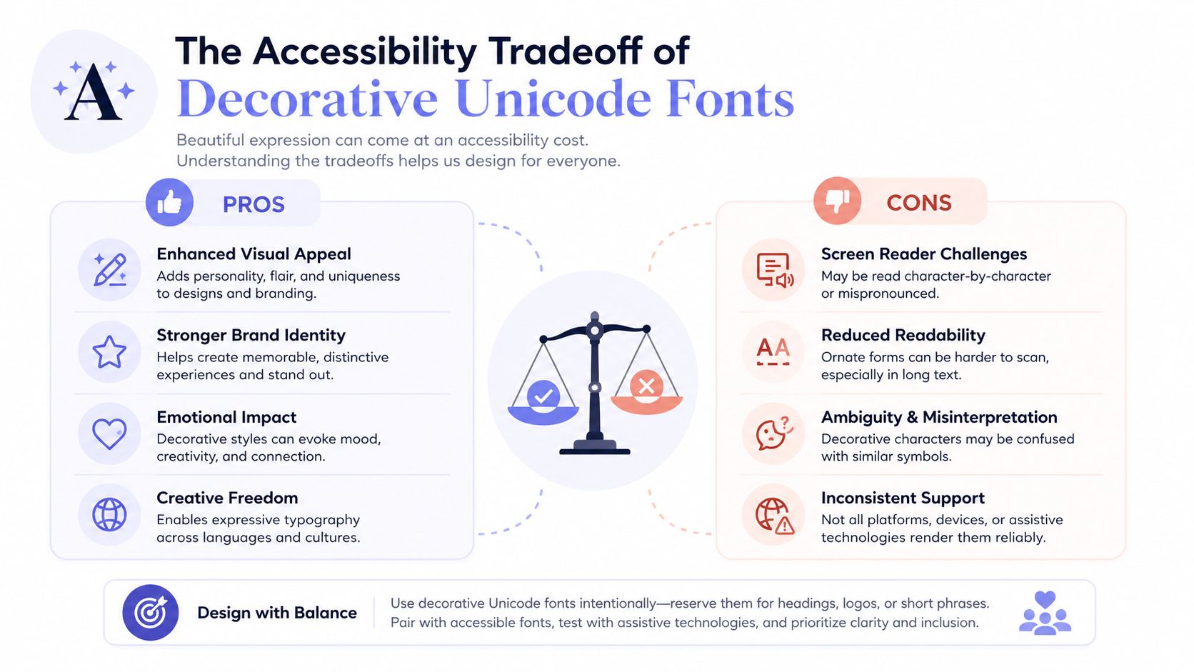 An infographic illustrating the pros and cons of using decorative Unicode fonts for accessibility in digital design.
Style helps when the message is short
Decorative Unicode is useful when you need a headline, a bio accent, or a compact call to action that should stand out at a glance. It's much less useful when the text needs to carry instructions, conditions, or nuanced meaning. Several formatter guides explicitly frame stylized text as safest for short phrases or headings, not critical information (CreatorsJet).
That aligns with the practical limit of the medium. Instagram is mobile-first, and the content is often consumed quickly. A stylistic accent can improve visual hierarchy in a bio or opening hook, but the same treatment can bury meaning in a longer caption.
Readability beats decoration for anything important
The core issue is comprehension. Unicode-styled text can become harder to parse in long captions, and accessibility tools may not interpret every variant consistently. If the message matters more than the mood, use ordinary text and reserve styling for a short opener, a section label, or a lightweight CTA.
For a more formal way to think about readability, the guide by Font Checker Pro is a useful reference point. It's not Instagram-specific, but the underlying idea transfers cleanly. If a font choice makes text harder to read in one pass, it's the wrong choice for the part of the post that carries the actual meaning.
A simple boundary for teams
Use decorative text for:
Bios and headers where the goal is visual distinction.
Short hooks that benefit from contrast.
Lightweight CTAs that don't carry important conditions.
Avoid decorative text for:
Instructions that need to be read correctly the first time.
Long captions where fatigue already lowers readability.
Links, dates, and policy language that should stay unambiguous.
The safest practice is boring, and that's fine. If the text needs to be read accurately, plain Unicode wins. If it just needs to pop, a restrained style can do the job without getting in the way.
Automating Formatted Instagram Posts with PostPulse
Manual formatting works until you need to repeat it every day. Then the friction shows up, especially if your pipeline also has to handle OAuth, refresh cycles, rate limits, and the usual publishing quirks that come with social APIs. Automation matters more than another font picker once the same caption has to move through the system without breaking line breaks or losing meaning on a different device.
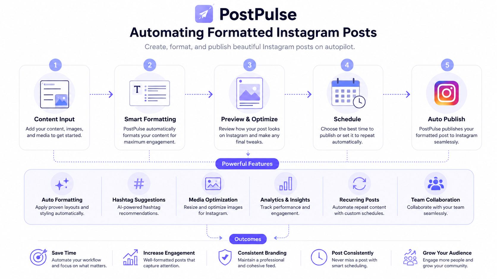 A diagram illustrating PostPulse's five-step automated workflow for creating, formatting, and publishing professional Instagram posts.
Build the text once, publish it many times
If your captions already live in Airtable, Notion, or a content queue, format them before publish and keep the styled output as part of the record. That way your automation only has to move text, not decide how the text should look. In practice, the workflow can generate a caption, preserve the line breaks, and push the final version into publishing without a human re-copying it.
PostPulse is the social media publishing platform for apps, automations, and AI agents. One integration publishes to 9 platforms via a REST API, official n8n and Make.com nodes, or an MCP server, and you can white-label the whole flow under your own brand. For Instagram, that matters because the same formatted caption can move through a single surface instead of being re-authored for each destination.
Handle the publish step like a container workflow
Instagram publishing is container-based, so the operational pattern matters. You create the container, wait for processing, then publish. If your automation skips the wait or retries too aggressively, the result can be a messy failure loop instead of a post. That is the kind of issue PostPulse is built to absorb, so you are not wiring the token handling and version churn yourself.
The same logic applies if you are triggering posts from AI output. A Claude-generated caption still needs cleanup, line breaks, and a stable publish path. The formatter is only the front end. The automation layer is where reliability gets decided.
The cleanest setup is the one that separates content generation, formatting, and publishing into different steps.
A useful companion reference is my Instagram automation experiment, especially if you are comparing manual scheduling against a more structured pipeline. The point is not to make the process fancy. It is to make it repeatable when the content volume goes up.
You can also pair this topic with the internal guide on automated posting on Instagram if you are mapping a workflow from draft to publish. The same 125-character hook and 2,200-character cap from earlier apply here, automation should not break them. That is the right place to think about orchestration, not after the captions have already broken in production.
Your Instagram Text Formatting Checklist
Before you hit publish, run through the basics in the same order every time. Keep the first 125 characters sharp, stay inside the 2,200-character caption limit, and remember the 150-character bio cap if you're working on profile text (Sendible, UtilTap).
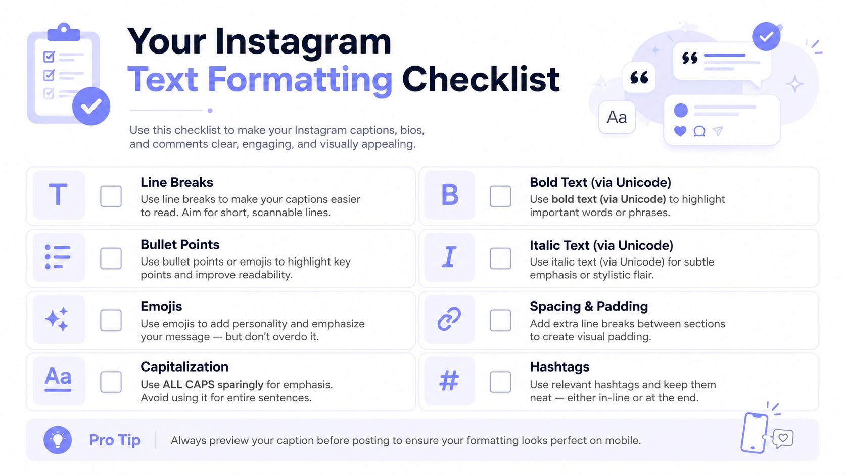 A checklist infographic titled Your Instagram Text Formatting Checklist featuring tips for improving caption readability and engagement.
Quick checks before publish
Hook first: make sure the opening line still works before the truncation point.
Spacing second: confirm the line breaks survive paste on the target device.
Style last: keep Unicode accents limited so the important parts stay readable.
Device test: inspect the post on the same phone you'll use to publish.
Automation ready: if the post repeats, keep the final formatted text in your workflow instead of redoing it manually.
If you're building this into a repeatable system, the internal caption length checker is a practical guardrail before scheduling. It helps keep the formatted result inside the limits that matter, which is the whole point of using a formatter in the first place.
If you're tired of fixing the same caption problems by hand, PostPulse gives you a single publishing layer for formatted Instagram text, scheduled posts, and automation workflows. It handles the messy parts of social publishing so you can focus on the copy, the structure, and the parts readers see. Visit PostPulse to see how it fits into your Instagram workflow.
About the Author

Founder of PostPulse — a social media scheduling platform for creators and teams. Software engineer with a passion for building developer tools and simplifying complex API integrations across social media platforms.