Social Media Reporting for Developers: Beyond Data Dumps
Published on June 17, 2026
Tags:
Someone always asks for a “quick” social media report like it's a CSV export and a bar chart away from done. Then you open the first API, realize one token is expired, another account lost permissions, one endpoint returns daily aggregates while another returns totals, and the metric names look familiar but don't mean the same thing. By lunch, you're not building a report. You're debugging a distributed systems problem with marketing labels.
That pain is normal. Social media reporting sits inside a channel that is massive, fragmented, and constantly active. By February 2025, there were 5.24 billion active social media user identities worldwide, equal to about 64% of the global population and 94.2% of internet users. The total had grown 4.1% over the prior year, while the typical internet user spent 2 hours and 21 minutes per day on social media and used 6.83 platforms per month, according to DataReportal's 2025 state of social overview. That scale is why reporting breaks so easily. You're not measuring one channel. You're trying to make sense of a multi-platform environment where the same audience bounces across apps all day.
The trap is thinking this is mostly a dashboard problem. It isn't. It's a collection problem, a normalization problem, and an interpretation problem. If you skip any of those, you end up with a polished lie.
Table of Contents
The Myth of the Simple Social Media Report
A stakeholder says, “Can you pull performance for Instagram, Facebook, LinkedIn, TikTok, and YouTube?” What they mean is, “I want one document that tells me what worked.” What developers hear is, “Please reconcile five systems that were never designed to agree.”
The first version usually starts manually. Export a few platform dashboards. Paste numbers into Sheets. Add a trend line. Promise yourself you'll automate it later. Then later arrives, and you discover that “later” means OAuth flows, rotating credentials, pagination, data freshness gaps, account-level permission drift, and a growing pile of one-off fixes nobody wants to own.
The work isn't the chart
The chart is easy. The painful part is everything before the chart.
You have to answer questions like these:
Which account owns the metric: Brand profile, page, ad account, or creator account?
What time window produced it: Rolling totals, calendar day, platform-local timezone, or UTC?
Is the metric comparable: Same concept across platforms, or same label with different behavior?
Can you trust the pull: Complete dataset, sampled result, delayed processing, or partial failure?
Practical rule: If a social report can't explain how the numbers were collected, it isn't finished.
Teams usually notice the reporting pain only after the process starts breaking. A weekly report goes out late because someone had to reauthenticate an account. A monthly review uses mismatched date ranges. An executive asks why impressions increased while lead volume didn't, and nobody can tell whether that was broader distribution or just the same audience seeing the same content more often.
That's why the benefits of automated reporting matter so much in practice. The chief gain isn't prettier dashboards. It's consistency, timeliness, and fewer chances for a human to introduce errors while copying data from platform UIs.
Stakeholders want certainty. The data gives you caveats.
The hardest part is that social reporting looks simpler than it is. Native dashboards encourage that illusion. They make every platform feel self-contained and obvious right up until someone asks for a cross-platform view.
If you've ever had to explain why native tools don't solve the whole reporting problem, the trade-offs in PostPulse vs Meta Business Suite in 2025 are a useful example of how quickly “one dashboard” turns into “one dashboard for one slice of the stack.”
Why Your Metrics Are Probably Lying to You
The most dangerous bug in social media reporting isn't an exception. It's a valid-looking number with the wrong meaning.
Teams love to aggregate “engagement” because it feels clean. Sum the likes, comments, shares, clicks, and reactions. Put a total on the dashboard. Done. The problem is that these labels only look standardized from far away. Up close, they're platform-native behaviors with different definitions, collection rules, and user intent.
A sound reporting stack has to normalize before comparison. That matters because reach, impressions, and engagement are not interchangeable. Reach is unique users exposed. Impressions count every display. High impressions with low reach usually means repeated exposure to the same audience rather than true audience expansion, as explained in this social media reporting breakdown from FlippingBook.
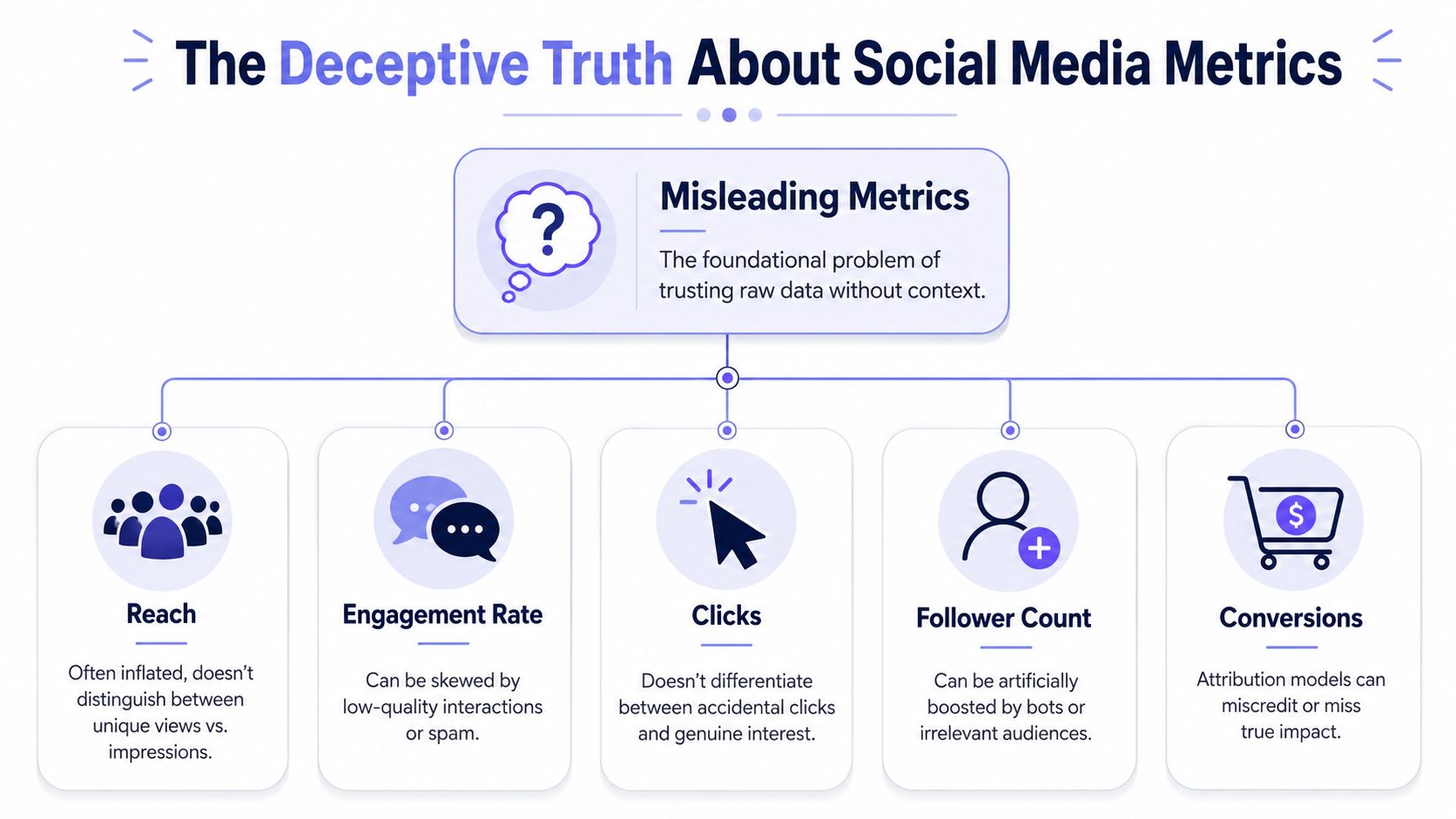 A diagram illustrating the misleading nature of common social media metrics like reach, engagement, clicks, and conversions.
Same label, different operational meaning
Developers need to be stricter than marketers. Don't store platform labels as if they were universal facts. Store the raw metric, its platform, its scope, and your normalized interpretation.
Metric label | What teams assume | What you should actually ask |
Reach | Audience size | Was this unique users, estimated users, or account-level exposure? |
Impressions | Visibility | Total displays, but did repeated exposure dominate the count? |
Engagement | Interest | Which interactions are included, and are they equal in intent? |
Clicks | Traffic quality | Click to where, under what UI element, and with what follow-through? |
Follower growth | Brand momentum | Was growth tied to strong content, paid distribution, or low-quality audience acquisition? |
Conversions | Business impact | What attribution model connected the conversion back to social? |
That table isn't academic. It changes architecture decisions. If your schema only has metric_name, value, and date, you've already made future analysis harder.
Build a translation layer first
A useful normalization layer usually does three jobs:
Preserve the raw metric: Keep the original platform field and value so you can audit changes later.
Map to a canonical concept: Translate raw fields into categories like exposure, interaction, audience growth, or conversion.
Attach interpretation rules: Record whether the metric is unique-based, event-based, ratio-based, or attribution-dependent.
That last part is where most homegrown dashboards fail. They normalize names but not semantics. Renaming everything to engagements doesn't solve anything if one source includes lightweight reactions and another bundles in clicks or saves.
Don't compare metrics just because they fit in the same column.
Reporting without context creates fake confidence
The right report doesn't stop at counts. It adds explanation. FlippingBook's guidance is solid here: combine reach, impressions, engagement rate, audience growth, and conversion metrics, then interpret them through a “what happened / why / what next” lens instead of shipping raw totals alone.
A simple example:
If impressions rise and reach stays flat, you may be hitting the same audience more often.
If engagement rises while conversion stays flat, the content may be interesting without matching user intent.
If audience growth increases but downstream actions don't, you may be attracting the wrong people.
That's why a metric dictionary belongs in your codebase, not in someone's head. It should sit next to your ETL logic and version with it. If you need a concrete example of how one platform-specific metric can confuse reporting, this breakdown of Instagram impressions shows why labels that sound obvious often aren't.
Building Your Data Collection Pipeline
Once you stop trusting raw labels, the next headache arrives fast. You still have to collect the data reliably.
Most first attempts look roughly the same. One cron job per platform. A few API clients. Secrets in a vault. Raw responses dropped into a table. Then reality shows up. One API returns nested arrays. Another wants cursor-based pagination. One account disconnects unexpectedly. Another succeeds but omits a field you assumed would always exist.
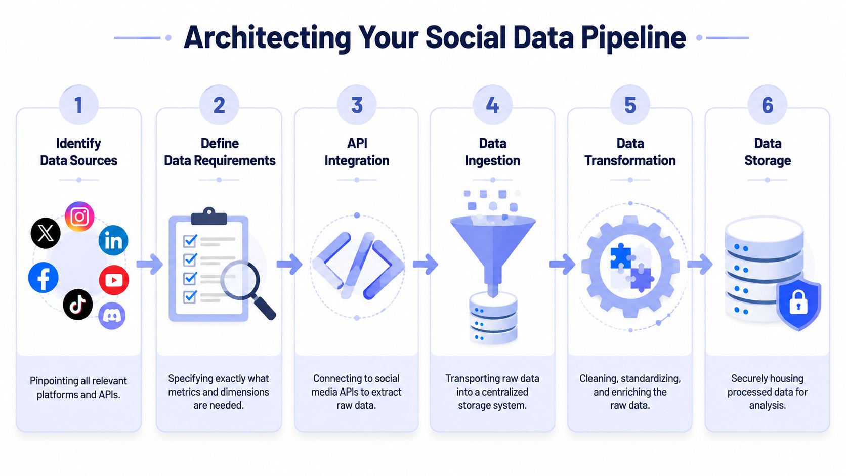 A six-step infographic showing the process of building a social media data pipeline for analytics.
Start with a boring ingestion design
The best reporting pipelines are boring in the right places. They avoid cleverness and optimize for recoverability.
A resilient shape looks like this:
Connector workers pull data from each platform independently.
Raw payload storage keeps the untouched API response for audit and replay.
Normalization jobs transform raw metrics into your internal schema.
Validation checks flag missing dimensions, empty windows, or schema drift.
Serving tables expose stable reporting views to dashboards and exports.
If you skip raw payload storage, debugging becomes miserable. When a number changes unexpectedly, you'll have no way to tell whether the platform changed the response, your parser broke, or the account returned partial data.
Token hell is an operations problem
Developers usually treat auth as a setup task. In social media reporting, auth is ongoing maintenance.
Accounts get disconnected. Scopes change. Users revoke access. Refresh logic fails at the worst possible time, usually right before a scheduled report. Even when the API client is correct, your operational model can still be fragile if you don't track token status, last successful sync, and per-account error state.
Build explicit states into your system:
Healthy: last sync succeeded and data freshness is inside expectation
Retrying: transient failure, safe to retry automatically
Action required: account owner needs to reconnect or grant permissions
Degraded: partial data available, but one or more endpoints failed
Operational note: A dashboard should surface connector health before it surfaces performance charts.
This is one reason developers often end up evaluating unified publishing and platform tooling alongside reporting infrastructure. If you're already working through account connectivity and platform surface area, it helps to understand the trade-offs in broader stacks like these top social media management solutions.
Expect pagination, backfills, and idempotency problems
The ingestion logic itself needs guardrails. Reporting data is rarely a one-and-done fetch.
Some practical patterns that hold up:
Use idempotent upserts: A re-run should correct data, not duplicate it.
Track sync windows explicitly: Store
requested_start,requested_end, andactual_received_at.Separate historical backfills from daily syncs: They stress connectors differently.
Version your mappers: When a platform response changes, you need to know which transform logic produced which rows.
A common mistake is writing one giant “sync everything” job. Don't. Break jobs down by platform and by resource type. Posts, profile metrics, and media-level insights often fail differently and need different retry behavior.
Normalize dimensions, not just metrics
Metric names get the attention, but dimensions cause just as much damage. Reporting falls apart when one source uses account-local dates, another uses UTC, and a third returns an aggregate without the dimensions you expected.
At minimum, normalize these fields:
Dimension | Why it matters |
Account identifier | One brand may own multiple profiles across networks |
Platform | Needed for interpretation and auditability |
Time window | Prevents mixed daily, weekly, and lifetime values |
Content identifier | Lets you tie profile-level and post-level analysis together |
Metric scope | Distinguishes post, account, campaign, or audience-level data |
Build for schema drift from day one
Social APIs change. Fields move, get renamed, disappear, or start returning null in cases they didn't before. You can't prevent that. You can detect it early.
Useful habits:
Log unmapped fields: New payload fields may signal a platform change worth reviewing.
Alert on sudden null spikes: A parser bug and a platform deprecation can look identical at first.
Keep sample payload snapshots in tests: They catch breakage before dashboards go blank.
If you're working with Instagram data specifically, the Instagram Graph API overview is a practical reminder that social integrations aren't just about endpoints. They're about permissions, object relationships, and understanding which data belongs to which entity.
Structuring Reports for Different Audiences
A reporting system fails just as often in presentation as it does in collection. Developers ship one dashboard because one dashboard feels efficient. Then nobody uses it because it tries to answer executive questions and operator questions with the same screen.
That never works.
The most useful reporting systems are built around goal-based KPI selection and a fixed reporting cadence, not maximum metric volume. Guidance summarized by Sprout Social's social media reporting article recommends defining objectives first, selecting only the KPIs tied to those objectives, segmenting by platform or campaign, and comparing across consistent windows such as weekly, monthly, MoM, QoQ, or YoY. It also stresses concise summaries, historical comparisons, and automated dashboards to reduce lag and human error.
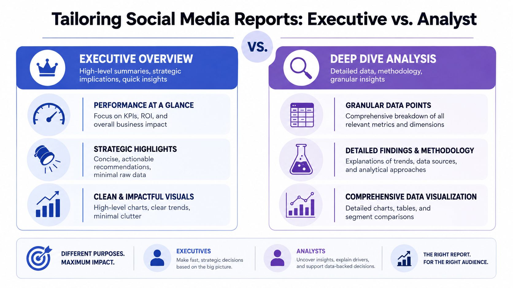 A comparison chart showing differences between executive summaries and analyst deep dive social media reporting styles.
Executive reports need compression
Executives usually want three things: whether performance moved, what caused it, and what decision that should change. They do not want to inspect post-level variance unless the variance changes budget or risk.
A good executive report tends to include:
A small KPI set: Exposure, engagement quality, conversion-related outcomes, and spend context if relevant.
Trend framing: Fixed-window comparisons that show whether movement is noise or direction.
Decision prompts: Increase investment, hold steady, investigate a drop, or shift mix.
The dashboard design should reflect that. Fewer charts. Clear labels. Short annotations. No giant metric wall.
Decision filter: If a chart doesn't support a budget, channel, or priority decision, it probably doesn't belong in the executive view.
Operator reports need granularity
The social manager, analyst, or content lead needs the opposite. They care which posts overperformed, what format patterns showed up, where engagement quality changed, and which platform-specific behavior needs investigation.
That report should answer questions like:
Audience | Core question | Useful view |
Executive | Are we moving toward business goals? | Summary cards, trend charts, short narrative |
Social manager | Which content patterns worked? | Post-level tables, content tags, engagement breakdowns |
Analyst | What explains the movement? | Segments, anomalies, methodology notes, raw metric access |
Often, developers overcorrect. They hide detail to keep the UI clean. That makes the tool look polished but strips away the exact evidence operators need to act.
One dataset, multiple report contracts
The fix isn't multiple pipelines. It's one clean model with multiple reporting contracts.
For example:
The executive layer might expose only normalized KPIs, trend deltas, and commentary fields.
The operational layer can include content metadata, platform-native metrics, publishing timestamps, and tags.
The analyst layer may expose raw-to-normalized mapping details and data quality flags.
That separation helps with trust. Executives get clarity without clutter. Analysts keep traceability. Operators don't lose the detail they need to improve content.
It also forces better product decisions. When you know who the report is for, you stop rewarding metric hoarding. You start designing for decisions.
Turning Data into Actionable Insights
A dashboard full of social metrics still isn't useful if every meeting ends with, “Interesting, but what should we do?” That's the line between reporting and insight. Most systems never cross it.
 A woman sketching data insights and user analytics on a notebook while reviewing business dashboard charts.
The practical move is to make every report answer three questions in order:
What changed?
Why did it likely change?
What should the team do next?
That sounds obvious, but it forces discipline. You stop shipping screenshots of charts and start adding interpretation.
Use comparisons carefully
Historical comparison helps, but only when the windows are fixed and the caveats are visible. MoM, QoQ, and YoY views are useful because they reveal movement over time rather than snapshot noise. They're also easy to misuse when seasonality, campaign timing, content mix, or platform behavior changed underneath the numbers.
Another issue is that platform-reported metrics are often noisy, incomplete, or misleading. Good reporting needs transparency about attribution limits, cross-platform comparability problems, and what executives should not infer from dashboards, as discussed in Supermetrics' writing on social media reporting quality.
A better workflow looks like this:
Flag the change: Reach down, saves up, clicks flat.
Add local context: Fewer posts, different content format, timing shift, or account issue.
State confidence level: Strong evidence, partial evidence, or tentative interpretation.
Recommend a next action: Test a format again, change audience targeting, revise cadence, or hold until another cycle confirms the trend.
Add a narrative layer, not just alerts
Teams often automate alerts but skip narratives. “Engagement down” is an alert. “Engagement down after a format mix change while profile visits stayed stable, so the issue may be creative resonance rather than top-of-funnel visibility” is a useful observation.
Report the limitation with the finding. If the evidence is partial, say so in the same breath.
That practice matters because social platforms control much of the measurement surface. You don't always get a clean view into intent or downstream impact. So the strongest reporting combines relative indicators with qualitative evidence, audience signals, and explicit caveats.
A short weekly narrative can be more valuable than a dense monthly dashboard if it helps the team choose the next experiment. This video is a good companion if you're thinking about how analysts turn raw performance data into a clearer story.
What good insight output looks like
A useful summary often fits in a few sentences:
What happened: Short-form educational posts produced broader visibility than product clips this period.
Why it likely happened: The creative aligned better with current audience interest, but conversion impact is still unclear.
What's next: Repeat the winning format with a stronger CTA and watch whether profile actions move with it.
That's the key upgrade. The team stops asking for “the numbers” and starts using the system to decide what to publish, where to focus, and what to ignore.
From Data Janitor to Insight Engine
The shift in social media reporting isn't about prettier dashboards. It's about refusing to treat exports as truth.
A solid system does four things well. It collects data reliably, preserves raw context, normalizes metric meaning before comparison, and presents different views for different decisions. Then it adds the part most dashboards skip. It explains what changed, why it probably changed, and what should happen next.
That changes your role. You're no longer the person people ping for screenshots before a meeting. You're the person who built the reporting layer that the team can trust. That means fewer manual pulls, fewer arguments about whose numbers are right, and fewer meetings wasted on metric archaeology.
The work is messy. APIs drift. Tokens expire. Platform labels stay inconsistent. But once the system is designed around resilience and interpretation, those problems become manageable engineering tasks instead of recurring business chaos.
If you're building publishing or reporting infrastructure and don't want to own every platform integration yourself, PostPulse is worth a look. It gives developers one integration for publishing across multiple networks through a REST API, official n8n and Make.com nodes, or an MCP server, which is useful when you want to spend more time on product logic and insight workflows than on platform churn.
About the Author
Founder of PostPulse — a social media scheduling platform for creators and teams. Software engineer with a passion for building developer tools and simplifying complex API integrations across social media platforms.