LinkedIn Graphic Dimensions: The 2026 Developer Guide
Published on
Tags:
You export a banner from Figma, upload it to LinkedIn, and it looks clean on desktop. Then you open the profile on your phone and everything falls apart. The text sits under the UI, the focal point is off-center, and the image that looked sharp in your design file now looks like it got re-saved three times.
That's the normal LinkedIn graphics experience if you treat image specs as a simple pixel lookup problem. It isn't. LinkedIn image handling is a mix of aspect ratio rules, responsive cropping, feed layout quirks, and platform compression. The dimensions matter, but the reason they matter is what saves you from shipping ugly assets.
I've seen the same failure pattern over and over. Teams use an outdated template, trust a design tool preview too much, or reuse one asset across profile, company page, and feed placements because it seems “close enough.” It never is. If you've ever needed help spotting digital image compression, that's usually a sign the original export or upload target was wrong before the asset even hit LinkedIn.
Table of Contents
Why Your LinkedIn Graphics Look Awful
The usual problem isn't that the file is “bad.” It's that the file was designed for one rendering path and LinkedIn displayed it through another.
A personal banner is a good example. In Figma, you're looking at a fixed frame. On LinkedIn, that same image sits under profile chrome, shifts across device sizes, and gets judged after compression. So the thing that looked balanced on your artboard can feel randomly cropped once the platform lays its UI on top of it.
The real failure is layout assumptions
Most broken LinkedIn graphics come from one of these mistakes:
Wrong asset for the placement: A company banner gets reused as a personal banner, or a link preview gets dropped into a native feed post.
No safe zone planning: Text and logos sit too close to edges or UI overlap regions.
Export-first thinking: People optimize the file before they validate the aspect ratio.
One-device checking: Desktop looks fine, mobile reveals the damage.
LinkedIn doesn't reward “almost the right size.” It punishes it visually.
That's why a bare list of dimensions doesn't solve much. You need to understand what each ratio is buying you. Some ratios maximize screen footprint in the feed. Some reduce crop risk. Some exist because LinkedIn's page layout is wide and shallow, not because designers enjoy working with awkward canvases.
Why developers care about this too
If you build publishing features, this gets more annoying. A bad image spec doesn't just make a post ugly. It creates support tickets. Users blame your uploader, your resizing logic, or your API integration, even when the issue started in their source asset.
So when people ask for linkedin graphic dimensions, what they usually need is stricter than a cheat sheet. They need constraints they can encode. Validate dimensions before upload. Preserve aspect ratio. Avoid “smart” resizing that stretches. Keep placement-specific templates instead of trying to infer intent from one generic image.
LinkedIn Dimensions Quick Reference Cheat Sheet
If you need the numbers first and the rationale second, use this as your lookup table. These are the dimensions worth validating in a design system, uploader, or publishing workflow.
For practical resizing workflows, I like resources that focus on execution rather than theory. These tips for perfect LinkedIn images are useful if you're fixing assets quickly before upload.
LinkedIn Image Dimensions 2026
Placement | Dimensions (Pixels) | Aspect Ratio | File Size (Max) |
Personal profile banner | 1584 x 396 | 4:1 | 8MB |
Company page banner | 1128 x 191 | 5.9:1 | 8MB |
Single-image post | 1080 x 1080 | 1:1 | 5MB |
Single-image post | 1080 x 1350 | 4:5 | 5MB |
Link preview image | 1200 x 627 | 1.91:1 | 5MB |
Carousel slide | 1080 x 1080 | 1:1 | 5MB |
Carousel slide | 1080 x 1350 | 4:5 | 5MB |
A few quick decisions fall straight out of that table:
Use 4:5 for feed images when you want more vertical presence.
Use 1:1 for simpler production when consistency matters more than screen height.
Treat profile and company banners as separate templates because their ratios are materially different.
Keep every carousel slide identical in size or the layout starts looking broken.
Personal Profile Images Deep Dive
You upload a banner that looks sharp in Figma. Ten minutes later, LinkedIn has softened the text, shifted the crop, and parked profile UI on top of the area you cared about. That is the core challenge here. You are not designing a static image. You are designing for a responsive header with awkward overlays.
The personal profile banner works best at 1584 x 396 pixels, which gives you a 4:1 aspect ratio. The number matters less than the behavior behind it. LinkedIn needs a very wide asset because the header has to survive different viewport widths, profile layouts, and image scaling paths without turning into a blurry strip. If you start from an older or smaller file, LinkedIn usually compensates by scaling up and recompressing. That is where text edges get muddy fast.
Profile photos have a different failure mode. The file may upload fine, but LinkedIn renders it as a circle, so square-safe composition matters more than raw dimensions. Keep the face centered, leave breathing room around the head, and assume the corners will be discarded. If you handle uploads inside a product or CMS, pre-crop user headshots to a centered square instead of letting people guess where the circular mask will land.
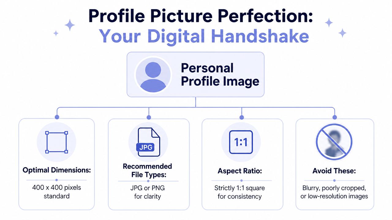 An infographic titled Profile Picture Perfection showing recommended dimensions, file types, and aspect ratio for profile photos.
The banner spec that actually works
Use this baseline for personal banners:
Canvas size: 1584 x 396
Aspect ratio: 4:1
Formats: JPG or PNG
Resolution: At least 72 DPI
File size: Under 8MB
Those specs are only the starting point. The primary constraint is safe area. LinkedIn does not treat the full canvas as reliably visible space, and the profile card elements eat into the composition, especially around the left side and lower portion of the banner.
Safe zones matter more than the canvas size
This is the part design guides usually skip.
A LinkedIn personal banner behaves like a responsive container with UI layered over it. If you place a logo, headline, or face near the edges, it may still technically fit inside the image file and still fail in the actual profile layout. Mobile makes this worse because the visible crop changes and the center of attention shifts.
A safer working method is to design from the middle out:
Keep primary text and logos in the central band
Avoid the lower-left area for anything meaningful
Treat the outer margins as flexible, decorative space
Use backgrounds, gradients, and abstract shapes near edges, not copy
I usually build banners with a "survival zone" in mind. If the message only works when the entire 1584 x 396 canvas is visible, the layout is too fragile for LinkedIn.
If you need to adapt an existing asset, this LinkedIn image resizer for profile and banner formats can get the file onto the right canvas. It will not fix a layout that ignores the safe area.
A walkthrough is sometimes easier than static screenshots. This video does a decent job showing the mechanics people often miss during setup:
Export choices that keep the banner usable
Export format is a trade-off, not a rule.
Use PNG for banners with small text, logos, icons, or hard contrast edges. It usually preserves crisp boundaries better after LinkedIn processes the file. Use JPG for photographic banners where file weight matters more than perfect edge definition. In both cases, export from the full-size source. Do not upload a smaller image and hope the platform rescales it cleanly.
Text is where compression damage shows up first. Thin fonts, light weights, and low-contrast type over textured backgrounds tend to fall apart after upload. If the banner includes copy, increase font size, raise contrast, and test the result on both desktop and mobile before calling it done.
Company Page Branding Assets
You upload the company banner, it looks passable on desktop, then the mobile view turns the headline into a thin strip and the focal point drifts under the page chrome. That usually happens because the file was designed like a profile banner. Company pages use a much shallower canvas, so assets that survive on a personal profile often collapse here.
The practical issue is aspect ratio, not just pixel count. A company banner sits in a long, compressed slot, which gives you far less vertical room for copy, faces, product UI, or anything that needs breathing space. Reusing a personal cover image almost always forces a bad compromise. You either crop away the useful part or shrink everything until it loses impact.
Why reused assets fail on company pages
LinkedIn's company banner spec is much wider relative to its height than the personal banner covered earlier. That changes the design rules.
Tall compositions break first. So do layouts with copy stacked over two or three lines, portraits with the subject centered high or low in frame, and banners that hide important detail near the bottom edge. LinkedIn's responsive rendering makes this worse because the visible area is not perfectly consistent across devices and page states.
I treat company banners as UI backgrounds with branding, not as miniature campaign posters.
That shift helps. A shallow banner can still do useful work if it carries one idea clearly: brand color, one short line, one product cue, one environmental image, or one simple illustration. The more jobs you assign to that strip, the worse it performs.
Design for the safe area, not the full canvas
The biggest mistake is designing to the entire exported image. The full file may upload fine and still fail in practice because overlays and responsive cropping eat into the edges.
Keep important content in a centered safe zone. Leave extra horizontal and vertical margin around text and logos. If the message only works when every pixel remains visible, the layout is too brittle for LinkedIn's company page UI.
Here is the simpler way to evaluate each asset:
Asset | What it needs to do | Failure mode to watch for |
Company logo | Stay recognizable at small sizes and against varied UI backgrounds | Thin marks, tiny text, and low-contrast edges disappear |
Company banner | Support brand context without carrying the whole message | Multi-line copy, bottom-edge details, and tight crops get clipped or crowded |
The logo and banner should not compensate for each other. If the logo is weak at small sizes, the banner will not save it. If the banner needs a full paragraph to explain the company, the page header is doing too much work in the wrong place.
Teams building publishing tools should also separate company-page validation from profile-banner validation. They are different placements with different failure patterns. A decent LinkedIn media upload workflow for company assets should catch aspect ratio mismatches, warn about shallow text layouts, and preview how overlays affect the visible area before upload.
A few rules hold up well in production:
Keep copy short. One phrase is usually enough.
Use heavy, high-contrast type if text must appear in the banner.
Avoid placing critical detail near the bottom or extreme sides.
Export from the final canvas size instead of relying on LinkedIn to resize a larger master.
Treat the banner as supporting context. Let the logo, page name, and about section handle identification and explanation.
A good company banner feels intentional even when LinkedIn crops a little aggressively. That is the standard to design for.
Feed Posts And Carousels
A feed graphic can look clean in Figma, then ship to LinkedIn and fall apart on mobile. The usual failure is not raw pixel size. It is choosing the wrong aspect ratio for the placement, then packing the canvas right to the edges as if every viewer will see the same crop.
For native feed posts, 1080 x 1080 and 1080 x 1350 are the two sizes worth building around. Square is easier to standardize across a content team. Portrait gets more vertical space in the feed, which usually makes it a better fit for mobile attention. That extra height helps only if the layout respects a safe zone. Put small text, logos, or UI details too close to the top and bottom edges, and the post starts feeling cramped even before anything is technically cropped.
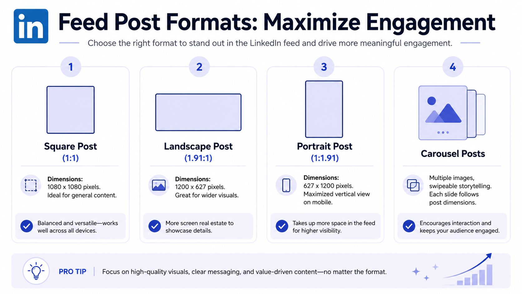 A professional infographic detailing the optimal dimensions and usage for various LinkedIn feed post formats.
Square versus portrait in the actual feed
Square is the reliable template format. It works well for charts, screenshots, quote cards, and product visuals because composition stays simple and reuse stays cheap. If a team is producing a lot of weekly posts, square usually creates fewer approval and export mistakes.
Portrait is stronger when the post needs hierarchy. A 1080 x 1350 canvas gives you room for a headline, one supporting idea, and a visual without forcing everything into the same horizontal band. That matters in responsive feeds because LinkedIn is trying to maximize scannability on narrow screens, not preserve your original design intent.
The trade-off is stricter layout discipline. More vertical room encourages teams to add more copy. That is where portrait posts go bad. A tall canvas should improve pacing, not become a thin infographic squeezed into a social post.
The required carousel rule
Every slide in a carousel should use the same dimensions. In practice, that means picking 1080 x 1080 or 1080 x 1350 and sticking to it for the whole deck.
This matters even more if you build or maintain publishing tooling. Mixed slide sizes create ugly edge cases. One slide gets padded, another gets scaled, another looks soft because someone resized a PNG instead of exporting from the source file. Local previews often hide that problem. Published carousels do not.
A validator should reject a carousel if:
Slide dimensions differ
Aspect ratios are inconsistent
A slide was resized after export instead of rebuilt from the original layout
Critical text or UI elements sit outside a consistent safe area
The API-side gotcha is simple. Do not assume LinkedIn will normalize your deck in a way users will like. If your product supports carousel publishing, store the first slide's width and height, enforce exact matches on every upload, and fail fast with a clear error. A proper LinkedIn carousel publishing workflow should also preview safe zones so users can catch edge-hugging layouts before publish.
Mixed-dimension carousels rarely break with a visible error. They just ship looking careless.
Where link preview images fit
Feed images and link preview images are different assets with different jobs. A native feed post should be designed for in-feed reading. An external link preview image is shaped for the card container and usually reads wider and shorter.
That distinction matters because developers often try to reuse one image across both systems. The result is predictable. A blog hero image that works fine for Open Graph metadata often looks undersized as a native feed post, while a tall feed graphic usually crops badly or loses clarity when forced into a link card ratio.
Use the asset that matches the rendering context:
Native post: square or portrait
Carousel: one aspect ratio across every slide
External link share: a separate preview image built for the link card
That extra export step saves a lot of avoidable rework.
Article And Link Sharing Graphics
People mix these up constantly because both can look like “a header image,” but they live in different systems.
A native LinkedIn article header is one asset. An external link preview image is another. The first belongs to LinkedIn's own article presentation. The second is typically pulled from your site metadata and rendered as a preview card.
Native article headers and external previews are different assets
For external links, the one hard spec you should respect is the preview image size already noted earlier: 1200 x 627. That ratio exists for card rendering, not because it's ideal as a standalone content image.
A native article header plays a different visual role. It behaves more like a hero image. In practice, that means you can use a broader composition and let the header support the article's tone rather than forcing it to function like a clickable card thumbnail.
The mistake is trying to make one image do both jobs.
A link preview image needs to survive card cropping and still read fast.
An article header can be more atmospheric and less text-heavy.
A feed image needs to compete in-scroll and usually benefits from more vertical presence.
What usually goes wrong with Open Graph images
Developers often assume that if the og:image exists, the result will be fine. That's optimistic.
The main issues tend to be:
The wrong aspect ratio for LinkedIn's preview card
Text placed too close to the card edges
A generic site-wide fallback image that says nothing about the page being shared
An updated image that LinkedIn hasn't refreshed yet
If you're generating social images dynamically, design for card resilience. Keep the message short, central, and legible. Don't rely on tiny product screenshots or detailed UI captures. They collapse quickly once rendered as a share preview.
A plain rule helps here. If the image only works when viewed full width in a design tool, it probably won't work as an Open Graph image.
LinkedIn Ad Specifications
Ads are where teams stop getting away with vague creative discipline. Organic posts can survive a rough edge or two. Paid creative gets judged harder because every formatting mistake wastes spend and makes the campaign look untrustworthy.
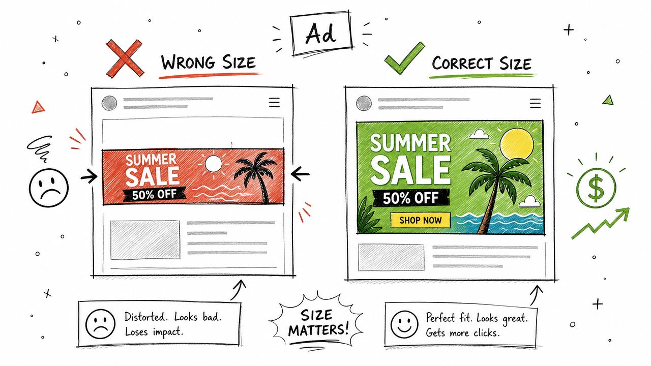 A diagram comparing incorrectly and correctly sized advertisement graphics to show how dimensions affect marketing impact.
What you can safely standardize
Even without leaning on unofficial ad-size lists, there are a few defensible choices based on the feed image standards already covered.
For image-led ad creative, these are the safest visual patterns to build around:
Square creative for broad reuse and easier templating
Portrait creative when you want more mobile presence
Link-card shaped creative when the ad experience is click-driven and preview-like
That doesn't mean every ad placement accepts the same file in the same way. It means your creative system should start from proven LinkedIn image ratios instead of improvising formats.
Ad creative fails in predictable ways
The ugly failures are repetitive:
Failure mode | What caused it |
CTA feels buried | Important copy sits too low or too close to edges |
Image feels soft | Export was too compressed or source file was too small |
Creative looks cramped | Too much text for the chosen aspect ratio |
Layout feels inconsistent | Organic post templates were reused for paid without adjustment |
For ad work, I'd keep the design language simpler than what you might tolerate in organic content. Fewer words. Bigger hierarchy. Clearer focal point. Stronger margins.
Paid creative has less room for cleverness and less tolerance for clutter.
If you're building campaign tooling, don't let users assume “works in the feed” automatically means “works for ads.” The safest product behavior is to treat ad assets as their own category with stricter review and preview states.
Common Pitfalls And Export Settings
You upload a file that looks sharp in Figma or Photoshop, then LinkedIn softens it, crops it a little differently on mobile, and suddenly the text feels off-center. That usually is not a design problem. It is an export problem.
Correct dimensions only get the asset onto the platform. The final result depends on how aggressively the file was compressed, whether the aspect ratio stayed exact through export, and whether you left enough safe space for LinkedIn's responsive layouts to shift the visible crop.
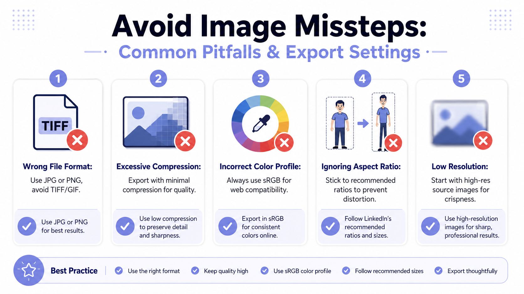 An infographic titled Avoid Image Missteps explaining five common mistakes when exporting images for social media platforms.
The pre-flight checklist I'd actually use
I check the file in this order before upload:
Lock the ratio first: Match the intended placement exactly before touching quality settings. A near-match ratio is how you get surprise crops.
Protect the safe zone: Keep logos, faces, and text away from the outer edges. LinkedIn surfaces do not reveal the same crop on every device.
Choose the file type based on content: Use PNG for text, UI mockups, icons, and logos. Use JPG for photography when the visual trade-off is acceptable.
Export from the original source: Do not re-save an already compressed asset. Each round of export can soften edges and introduce artifacting.
Respect file limits: Keep the upload within the placement limits noted earlier, but do not chase tiny file sizes so hard that the image falls apart.
Check multi-image sets for exact consistency: Carousel slides that differ by even a few pixels can look sloppy fast.
Where exports usually go wrong
The recurring failure is simple. Teams hit the right pixel dimensions, then lose quality in the last two minutes.
Small text suffers first. Fine lines, UI details, and logos also break down quickly once compression gets aggressive. JPG ringing around dark text on light backgrounds is a common offender, especially on quote cards, diagrams, and screenshots.
DPI causes confusion here. For LinkedIn graphics, pixel dimensions and aspect ratio matter more than print-style DPI settings. If the exported file has the right pixel size, stays within the platform limit, and preserves edge clarity, the DPI field is rarely the thing that saves or ruins it.
From a developer's viewpoint, this is really a rendering pipeline problem. LinkedIn has to display the same uploaded asset across desktop feed cards, mobile views, previews, and cropped containers. That is why safe zones matter more than many design teams expect. The platform is optimizing for flexible layout rendering, not for your exact artboard.
Export settings that hold up better
A practical baseline works well:
PNG for graphics with text or sharp-edged elements
JPG for photos, using high quality rather than aggressive compression
sRGB color profile for predictable web display
One clean export from the source file, instead of multiple resized copies
Manual review on desktop and mobile before handing the asset off as approved
If the graphic has dense copy, I usually choose PNG first and reduce visual complexity elsewhere to stay inside the file limit. If the image is photographic, JPG is fine, but I still zoom in and inspect edges around text overlays, faces, and product contours. LinkedIn can make a borderline export look worse.
The boring workflow is the one that holds up. Build to the correct ratio. Keep a real safe zone. Export once from the source. Then test the uploaded result in the placement where it will appear.
Frequently Asked Questions
Does LinkedIn support animated GIFs
LinkedIn's support and rendering behavior for GIFs can vary by placement and product path, and I'm not going to pretend there's one universal rule without official documentation that clearly states it. If motion matters, treat video as the safer production format and test the exact placement you care about before building it into an automated workflow.
What about video specs
Video is a separate media category from linkedin graphic dimensions. Don't reuse image assumptions for video pipelines. Aspect ratio, encoding, duration, captions, and playback context all matter. If you're implementing video upload support, check LinkedIn's official documentation for the exact upload path and accepted media requirements for the feature you're using.
How do you refresh an outdated link preview
If you've changed the preview image on your site and LinkedIn still shows the old one, the issue is usually cache persistence. Confirm the new Open Graph image is published and publicly reachable first. Then use LinkedIn's own tooling, if available for your workflow, to force a refresh or re-scrape. If that doesn't update quickly, republish after the metadata is definitely live.
How much text should go on an image
Use less than you want to. Feed graphics that read like posters tend to underperform visually because they look cramped and hard to scan. Keep one clear message on the image, then let the post copy do the rest.
A decent mental model:
One headline works
A headline plus short support line can work
Paragraphs inside images usually don't
If the design only makes sense after someone stops, zooms, and studies it, the image is doing too much.
If you're building publishing into a product, an automation, or an AI agent, PostPulse saves you from fighting every platform's media quirks one by one. You integrate once through a REST API, official n8n and Make.com nodes, or MCP, then publish across supported platforms without rebuilding the whole upload stack for each network.
About the Author

Founder of PostPulse — a social media scheduling platform for creators and teams. Software engineer with a passion for building developer tools and simplifying complex API integrations across social media platforms.